Brand Guide & Design System

Our Logo

Logo History Science of the Alcoa Logo Primary Secondary Clear Space Minimum Size Partnerships Location Logos Logo Rules

Alcoa Logo History

The Alcoa logo has been updated seven times over the course of our storied history, including when we separated from our former parent company in 2016. Beginning as the Pittsburgh Reduction company in 1894, as we transitioned to the Aluminum Company of America, and modernized to the trademarked, global acronym, Alcoa, as it is known today.

1894 - 1910

Our first corporate mark appeared in 1894, when Alcoa was still known as The Pittsburgh Reduction Company. The original mark was a circle broken down into four equal segments along with the company’s initials and the word "aluminum" — was used for 35 years, with only slight modification. Each of the segments contained a fivepointed star.

1910 - 1929

In 1907, The Pittsburgh Reduction Company was renamed Aluminum Company of America. The abbreviation "T.P.R.Co" was replaced by "A.C.O.A." In addition to the logo with the stars, the brand introduced a logo featuring empty segments.

1929 - 1955

By 1929, the short form of Aluminum Company of America— Alcoa—had caught on. Therefore, a new trademark replaced the roundel by taking the shape of a shield and the Alcoa name.

1955 - 1963

In 1955, a bold new rectangular mark was introduced. The company used rectangular logos housing the words "Alcoa" and "Aluminum" separated by a horizontal bar. The shield remained, though reduced in size. To the left, there was a combination of orange and blue triangles positioned symmetrically one above the other.

1963 - 1999

Renowned designer Saul Bass created this signature in 1963. The new emblem was inspired by the triangle motif from the previous logo. It now was reminiscent of the letter "A." It combines a symbol and our name, set in a specially designed typeface known as the Alcoa Alphabet.

1999 - 2016

The lettering “ALCOA” appeared below the triangle-inspired emblem. The palette grew simpler as the orange was removed. The emblem was white on the blue background. New York designer Arnold Saks modernized the classic trademark to reflect the character and style that took the company into the 21st century.

2016 - Present

In 2016, Alcoa Corporation split from its former parent company and launched as a company focused exclusively on bauxite, alumina and aluminum. The logo was updated to remove the box around the iconic Alcoa geometry, with its strong angles. The represents "out-of-the-box thinking".

Primary Logo

The Alcoa logo appears in one color: Alcoa Blue. This color has been specially formulated by Pantone®, Inc. The logo may be printed in black or reversed to white in certain instances. Under no circumstances should other colors be used. The logo has two configurations: horizontal or vertical. No other symbol, seal or graphic trademark may be displayed with the Alcoa trademark.

Horizontal Logo in Alcoa Blue

Vertical Logo in Alcoa Blue

Horizontal Logo in White
(Shown Reversed in Alcoa Blue)

Vertical Logo in White
(Shown Reversed in Alcoa Blue)

Secondary Logo

While Alcoa Blue is the designated color for our logo, it may also be printed in black or reversed to white in certain instances. Under no circumstances should other colors be used. The center of the graphic should always be transparent.

Horizontal Logo in Black

Vertical Logo in Black

Horizontal Logo in White
(Shown Reversed in Black)

Vertical Logo in White
(Shown Reversed in Black)

Clear Space

The logo is precisely proportioned. The elements are to be used in precisely the same size and position relationship. Clear space is the minimum amount of "breathing room" maintained around the logo. The clear space is to be kept free of type, graphics, or photographic elements. The space may be white or a single background color and, at a minimum, must be the height of the upper case letter "a" in the logotype.

Horizontal Logo Clear Space Requirements

Vertical Logo Clear Space Requirements
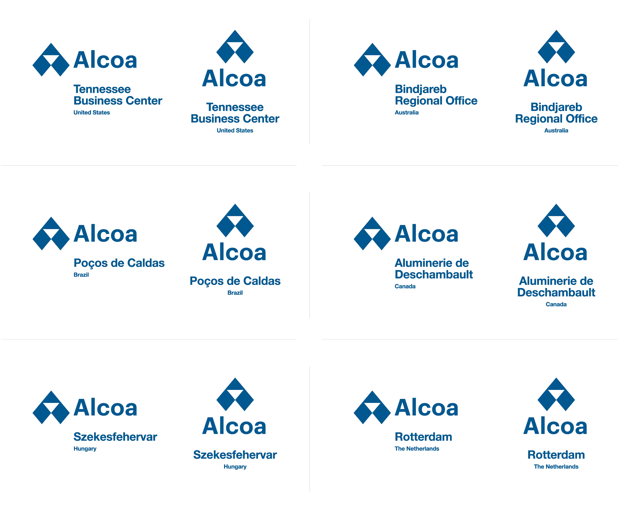
Minimum Size

Minimum size restrictions assist with preserving legibility of the Alcoa logo in print collateral and digital applications. When the use case of the Alcoa logo falls below the minimum size requirements, contact communications@alcoa.com for guidance.

The minimum sizes in print applications are 16mm for the horizontal logo, 10mm for the vertical logo, and 5mm for the symbol by itself. The minimum sizes in digital applications are 60px for the horizontal logo, 37px for the vertical logo, and 19px for the symbol by itself.

Minimum sizes allowed for Alcoa logo variants in print and digital applications.


Despite the minimum size restrictions, the Alcoa logo has been engineered to retain its defined geometric attributes. Modifications to the Alcoa logo should never be made to accommodate smaller (or larger) sizes under any circumstances.

Minimum sizes allowed for Alcoa logo variants in print and digital applications.

Logo Partnerships

Alcoa’s success relies on the relationships with its vendors, economic leadership, and partners. When the Alcoa logo is to be represented in conjunction with a partner(s) logo, the following guidedlines are recommended. As with any collaboration, be conscious of logo requests supplied by partner communication and marketing teams as this may lead to refinement of the guidelines outlined.

Alcoa has a policy that provides guidance regarding vendor endorsements. The use of the Alcoa mark with another company's logo must be reviewed and approved by Corporate Communications.

Clear Space

When displaying the Alcoa logo in partnership with another brand's logo, be respectful of each logo's usage requirements including clear space and minimum usage. If clear space is unknown, utilizing the logo's x-height to define a boundry is acceptable.

Allowable clear space for partnership logo lockups.


Identity Separation

When possible, a thin horizontal or vertical line should be utilized to further define each brand's identity and to signify a defined separation of each company's mission, vision, and values.

Equal Representation

When a partnership is defined, each brand's logo should be sized to be visually equal to the other. If a situation occurs where one brand's logo would need to be presented at a larger (or smaller) size based on sizing restrictions or defined by the partnership, contact communications@alcoa.com for review and approval.

A thin horizontal or vertical line should be utilized to define each brand's identity.

Location Logo Build

How global locations are represented with the Alcoa logo are key to a unified and inclusive brand. Samples of how a location should be typeset is provided on the following pages which incorporates clear space and font guidelines.

Horizontal Logo Clear Space — Adjustment

To create tighter synergy between the Alcoa logo and location, the lower clear space threshold is shifted to the baseline of the logotype.

The location and country labels are aligned flush left with the Alcoa logotype. The location label size is 50% of the cap height of the Alcoa logotype. The clear space below the location label is 33% of the logotype "A". The country label size is 25% of the cap height of the Alcoa logotype.


Vertical Logo Clear Space — No Adjustment

The lower clear space for the vertical logo remains unchanged.

The location and country labels are centered with the Alcoa logotype. Just as the horizontal location logo is built, the location label size is 50% of the cap height of the Alcoa logotype. The clear space below the location label is 33% of the logotype "A". The country label size is 25% of the cap height of the Alcoa logotype.


Location with Multiple Lines

The sample shown represents specifications for vertical logo with multiple lines. The line height between multiple lines of a location label should be 20% of the logotype "A".

The same specifications can be applied to the horizontal logo.

Location Samples

Sample Alcoa Location logos are provided for reference.

Logo Rules

Alcoa Logo Usage

Our logo is one of our most valuable assets. To ensure that it remains a strong representation of our company, it must be used consistently across all lines of communications. Misuse of the logo dilutes our identity and compromises our brand.

Only use Alcoa Blue, black, or white for the logo color. Do not use any other color or gradient.

Only proportionally scale the logo.
Do not stretch, condense, or deform the logo.

Be cognisant of logo clear space. Do not add words or elements that encroach the logo.

Only display the logo in its vertical or horizontal format. Do not display the logo at an angle.

Spacing is critical in maintaining logo integrity. Do not re-space or re-typeset the logo.

Only use the approved solid color logo variants. Do not outline the logo.

The logo was created without effects to retain a modern aesthetic. Do not apply filters, shadows, or 3D effects to the logo.

The logotype should always be displayed with the symbol. Do not display the logotype without the symbol.

Only use opaque logo variants.
Do not screen or decrease the logos opacity.


Backgrounds, Symbol Usage, Tagline

Use backgrounds that make the Alcoa logo prominent. Background colors and photos can easily overpower or compete with the logo. It is important that the logo be in contrast with the background. Contrast occurs when two elements are different. Accessibility issues can occur when there is not enough contrast between the foreground and the background.

Accessibility of the Alcoa logo is important for user legibility. Using the Alcoa logo as a foreground element in combination with background illustrations or images can create accessibility concerns. This practice is permitted but review that the backgrounds provide adequate contrast to the logo and the background does not distract from the brand. Contrast of the white logo against light color backgrounds and the Alcoa blue logo against dark color backgrounds could present accessibility issues.

The symbol should always be displayed with the logotype. Do not display the symbol without the Alcoa logotype.

The symbol should only be displayed in the logo colors. Imagery or illustrations within the logo symbol is prohibited.

Download Logos

Once you have completed review of the logo guidelines, Alcoa logo variants are available to download after completion of a short request form.

Submit Alcoa Logo Request